

What is a Mobile Friendly Website?
Mobile friendly website is a site that performs well on any screen, particularly smartphones and tablets. It adapts its layout, images, and words so that it is easy for users to simply read and click without having to zoom or struggle with teeny buttons. Essentially, it is a website that is designed to provide visitors with the best possible experience regardless of what device they view it on.
The defining feature of a mobile web design is responsiveness. This refers to the fact that the website will re-size and re-arrange content as needed to fit the screen. For instance, if you’re on a computer and you’ve got a wide menu at the top, on a phone the same menu shrinks down to a tap-button.
A mobile responsive website is also concerned with speed. Mobile users will be swiping more often, and therefore they need fast loading times. Compression of images, clean code, and getting rid of bulky stuff are all considerations for having a speedy and flowing site on mobile.
Another feature is easy navigation. Buttons, links, and forms are designed to be simple to tap with a finger, not just a mouse. Text is kept large enough to read comfortably without zooming. Pop-ups are minimized because they can block the screen on mobile and frustrate users.
Why Mobile Friendly Website is Important for Your Business
A mobile friendly website is no longer optional—it’s a must for every business. Individuals spend more time on their phones than they do on a computer. They search, shop, and book services every day on their mobile device. If your site is not optimized for mobile, you will lose these customers because they won’t linger on a slow and difficult-to-use site.
Search engines are also humongous in this respect. Google favors mobile-friendly websites in search rankings, so if your website is not quite phone-friendly, then it might not appear as high in searches. This has a direct impact on your visibility, your website traffic, and consequently your sales.
An optimized mobile website also instills trust. When customers view a clean, tidy website on their mobiles, they feel more trusting towards your firm. But when they notice teeny-weeny text, complicated menus, or broken layouts with effort, they might wonder about your brand’s trustworthiness.
Ultimately, a mobile-friendly web design translates into an improved overall user experience. It allows for the fact that regardless of what device a person is using, they can effortlessly find what they’re looking for, easily read information, and act without frustration. An effortless mobile experience tends to turn customers into repeat customers.
Benefits of Mobile Friendly Website
A mobile friendly website brings several powerful advantages to any business. It’s not so much a matter of the design being pretty; it’s a matter of how easily your customers navigate your site and how kindly search engines treat it. With most people now surfing with their phones, the advantages of a mobile-optimized site literally make or break your success and growth. These are the main advantages spelled out in easy-to-understand terms:
Better User Experience
A mobile-friendly website design makes your site easy to navigate on any device, be it a phone, tablet, or computer. The text can be read easily without zooming, buttons can be tapped with ease, and menus can be navigated without getting confused. When users enjoy themselves, they spend more time, and this makes them more likely to come back. A good mobile experience is what keeps your users interested and active.
Higher Conversions
If your website is easy to use on a phone, customers are able to act—whatever that action is, whether it’s purchasing something, making a reservation, or completing a form. It results in more conversions because customers do not drop off in mid-stream due to frustration. For instance, an ecommerce clothing website with a mobile friendly site can convert casual browsers into paying shoppers more frequently because checkout is fast and hassle-free.
Improved SEO
Search engines, and Google in particular, like mobile friendly websites by placing them higher in search rankings. A fast loading website that’s responsive to any screen with a great mobile experience gives Google good signals. This indicates that your website has a high probability of being visited by prospective customers looking for your products or services. Simply put, a mobile friendly website makes it easier to be found online.
Brand Credibility
A modern and mobile-friendly website gives your business a professional and credible appearance. Individuals gauge a business by its site, and if your site appears busted or hard to use on a cell phone, it will only ruin your reputation. Conversely, a clean and mobile-friendly layout demonstrates that you care about your clients and their time. It creates trust in the business.
Wider Audience Coverage
A mobile responsive website helps you reach more individuals at various levels of location and devices. With nearly everyone browsing through smartphones these days, you can reach much more individuals than a desktop version. Whether one is a local buyer searching for something around them or an individual on travel searching for products, a mobile responsive website does not allow you to miss out on such opportunities.
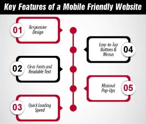
Key Features of a Mobile Friendly Website
A mobile friendly website is user centric. It ensures easy browsing, to the point, and hassle-free regardless of the device. Below are the major features behind a website being fully mobile friendly:
Responsive Design
A responsive design makes the website change its layout automatically according to the screen sizes. The site is clean and functional whether one is browsing using a large desktop screen or a small smartphone screen. For instance, a broad menu on desktop can become just a plain drop-down button on mobile.
Clear Fonts and Readable Text
The text must be easily readable without having to zoom in. A mobile-friendly web design has larger, readable fonts that are easy to read on small screens. Well-spaced paragraphs and lines ensure easier readability. Scanning and being able to comprehend the information should be easy for visitors.
Quick Loading Speed
Speed is the most critical characteristic of a mobile friendly website. Mobile users expect mobile pages to load within seconds. Mobile websites become fast and trustworthy with light design elements, avoiding unnecessary code, and compressing images. No visitors will remain on a slow website.
Easy-to-Tap Buttons and Menus
On a phone, one taps with the fingers, not the mouse. Buttons and menus need to be large enough and spaced enough to tap. A good mobile friendly web design is such that links are not stacked on top of each other, forms are easy to complete, and menus pop open easily.
Minimal Pop-Ups
Pop-ups are frustrating on a small screen. A mobile website has fewer or better-designed pop-ups that don’t interfere with a full view. This keeps people engaged with the main content and doesn’t drive them away in frustration.
How to Make Your Website Mobile Friendly
It is not necessarily simple to make a mobile friendly website. But with some effort, you can have a site that is user friendly and ready for whatever device you come across. Here are the best steps to take:
Use a Responsive Website Theme or Template
A responsive design is the backbone of a mobile-friendly site. If you’re building a new website or updating an old one, choose a theme or template that automatically adjusts to different screen sizes. Most modern website builders already include this option, so it’s a quick win for beginners.
Compress Images to Load Faster
Big images will make your site slow on cell phones. Optimize your images and photos so that they load extremely quickly without compromising on image quality. This one step can be a game changer in terms of creating a well functioning mobile friendly web site.
Keep Navigation Simple
Menus must be simple to find and simple to operate on a mobile phone. Keep menu labels short, reduce the number of items, and use simple icons where appropriate. A straightforward navigation system is simpler to assist visitors in finding the right page without getting lost.
Test Your Website on Different Devices
What appears good on one phone will not appear good on another. Make sure to view your site on other devices, including tablets. It ensures you detect such problems as overlapping text, invisible buttons, or lagging.
Use Free Tools Like Google’s Mobile-Friendly Test
Google has a free website and mobile test tool that examines how your site works on a phone. It will immediately report to you what does and doesn’t work. This is extremely helpful for beginners who need definitive feedback.
Common Mistakes to Avoid
As much as it’s all about becoming mobile friendly with a website, it’s equally essential to know what not to do. Most websites on mobile fail due to very simple errors that annoy people. Here are the most famous ones to avoid:
Too Much Text in Small Fonts
If your site has long paragraphs in a tiny font, mobile visitors will struggle to read. People don’t want to keep zooming in and back out. Use readable fonts, keep sentences brief, and break text into smaller pieces so it reads smoothly on small screens.
Slow-Loading Images or Videos
Big, uncompressed images and large videos make a site run slowly. Users on mobiles want quick results, and if your page takes ages to load, they leave. Compress images, use lighter formats for them, and only use videos when strictly necessary to keep your mobile friendly site quick.
Buttons Too Close Together
On a phone, people finger-touch, not mouse. If buttons or links are cramped together, then customers by accident press the wrong one. This will annoy the user and make them leave the page. Space out buttons and menus so they are finger-touchable at all times.
Heavy Pop-Ups That Block the Screen
Pop-ups are fine, but on a mobile they take up the whole screen. This hinders content and frustrates visitors. A mobile website must not use big pop-ups and use little ones strategically, which do not disrupt the user experience.
Conclusion
A mobile-friendly website is no longer a choice—it’s a requirement in the digital world today. Customers are accessing the internet more than ever, viewing products, booking services, reading reviews, and making impulse buys. If your website doesn’t display beautifully on a smartphone screen, you’ll be losing valuable visitors, leads, and sales. A responsive and user-friendly website on mobile gives you a clear advantage over your competitors that are still clinging to dated designs.
The advantages extend far beyond great looks. A mobile-optimized site will improve search engine optimization rankings because Google prefers mobile-optimized websites. It increases trust, enhances user experience, and compels users to linger longer, click more often, and make customers. And it demonstrates professionalism and reinforces your brand credibility, which makes your business appear credible and up to date.
In short, being mobile-friendly allows your business to power more growth through higher visibility, conversions, and user experience. Optimize for mobile today and provide your users with the seamless, frictionless experience they’ve come to expect. Pro help required? Get in touch with us for expert website and SEO services and let us build a site that works flawlessly on every device.
FAQ’s
What does a mobile friendly website mean?
A mobile friendly website is one that adjusts automatically to fit any screen size, making it easy to read and navigate on phones and tablets.
Why is a mobile friendly website important for SEO?
Google favors mobile-friendly sites in its rankings. This means having one can boost your visibility and help attract more organic traffic.
How do I check if my website is mobile friendly?
You can use free tools like Google’s Mobile-Friendly Test. It shows if your site works well on phones and gives tips to improve it.
Can a mobile friendly website increase sales?
Yes, because visitors find it easier to browse, read, and buy on a site that works smoothly on their phones, leading to higher conversions.
What are the common mistakes that make a site not mobile friendly?
Small fonts, slow-loading pages, hard-to-click buttons, and heavy pop-ups are common issues that frustrate users and hurt performance.